Project Overview
Bonfiglio Builders LLC has been in business for 31 years and was looking to update its brand and make it a little more organic. The client mentioned that they would like this to be clean and yet abstracted. I created an abstracted “B” letter form and then wrapped it in wood texture connecting them to the building industry.
Deliverables included:
Logo Creation
Website
Logo Design
In approaching this mark I began by selecting a modern San serif typeface that had sharp crisp lines symbolizing their attention to details. Knowing that this mark would need to hold up in a variety of sizes and usages, I provided a stacked logo, work mark as well as a symbol only marks.
Primary Color scheme
secondary colors

Are you looking for help with your brand?
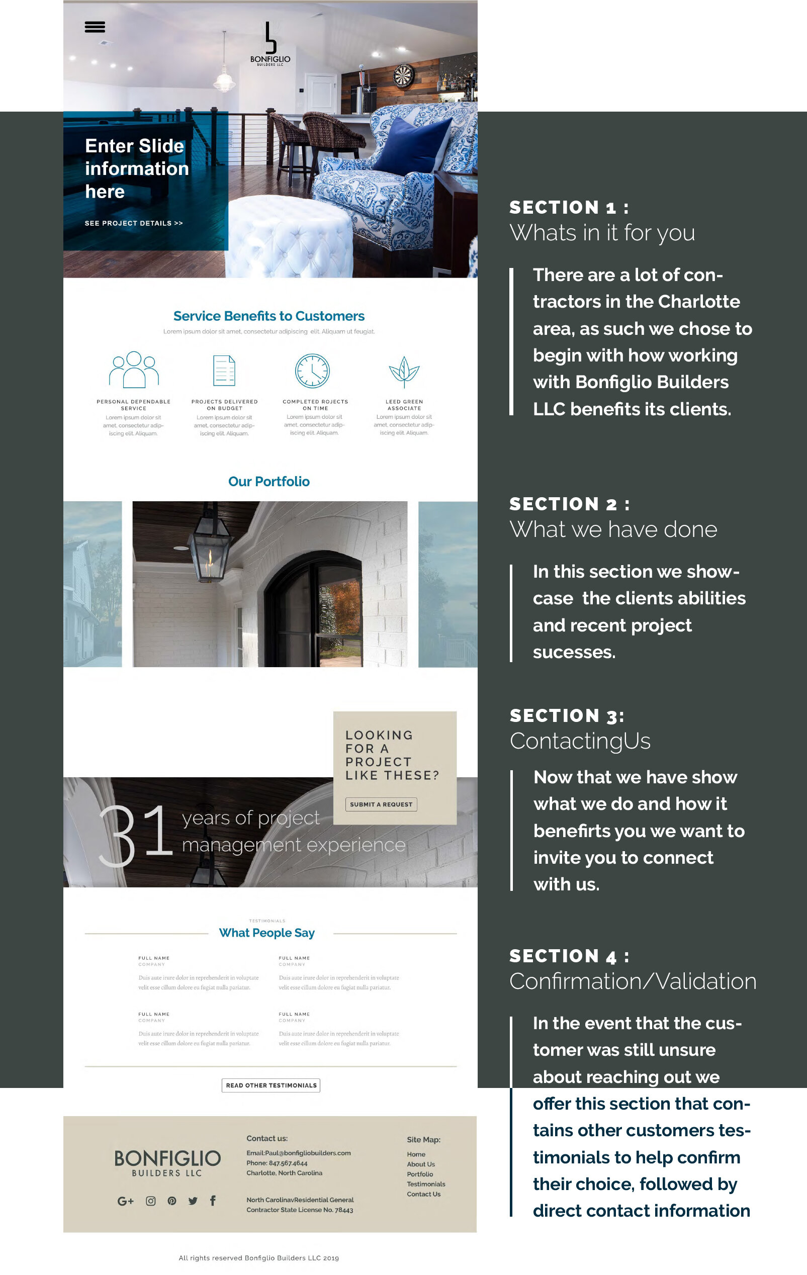
Web design
This was the first phase of work that I completed for this brand. Their original site no longer matched the position of the company and was not mobile-friendly, so I was tasked with reworking on the layout, iconography, and tone of voice for the brand. This was accomplished bringing in a cleaner style that highlighted their product and allowed the site to share their brand story more effectively.


