Project Overview
Diamond Creek Water is a well-established brand was looking for someone to come in and help with brand continuity. When stocked in the store shelves they believed their products might be being mistaken their competitors and well as a website that no longer matched their company culture.
Deliverables included:
Website
Event tent
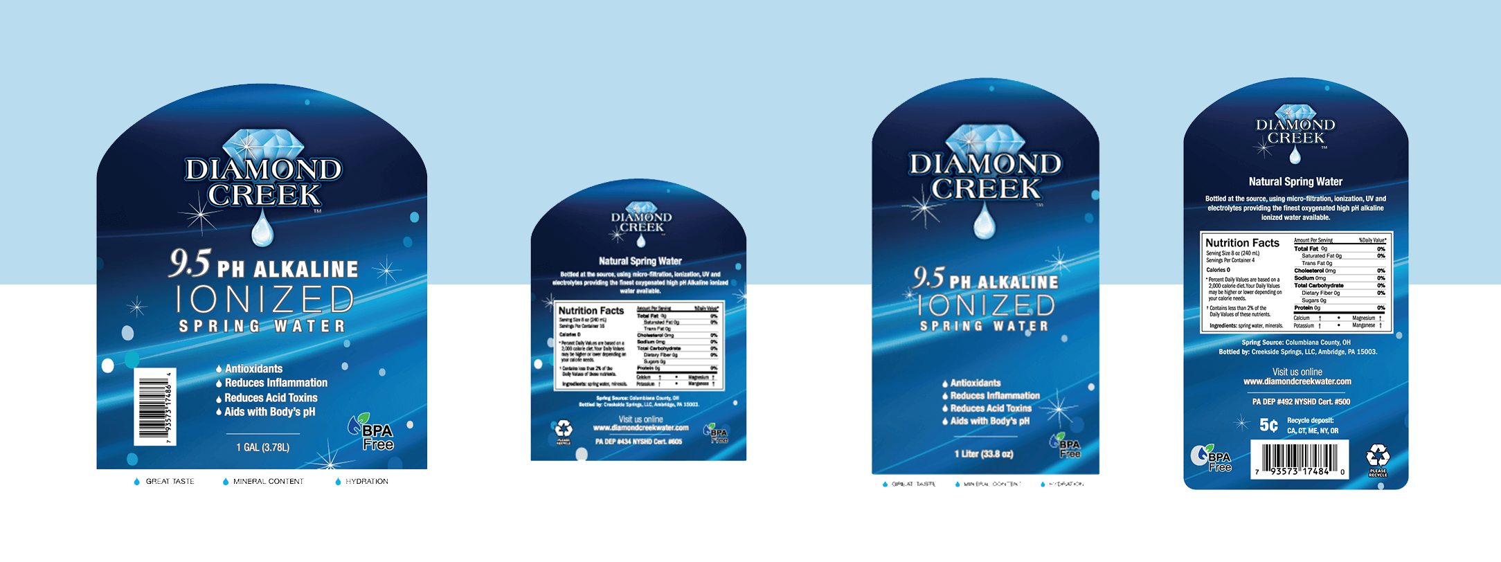
1 Liter bottle label
1 Gallon bottle label
Table cloth
Icon design
Packaging
Branded banners
Layout approach
This was the first phase of work that I completed for this brand. Their original site no longer matched the position of the company and was not mobile-friendly, so I was tasked with reworking on the layout, iconography, and tone of voice for the brand. This was accomplished bringing in a cleaner style that highlighted their product and allowed the site to share their brand story more effectively.
Design Challenges
In approaching the client requested that the management system be simply enough that they could manage the site themselves after launch. This meant that the google map of their locations would need to be custom coded so that new locations could be added without needed the geo-coordinates of each store.
The story Explained
The message behind the layout
Why choose Diamond Creek Water
Right off the bat I wanted to showcase their products and the benefits of using them. The image gallery presented three images in the three sizes Diamond Creek Water is sold in, overtop cool nature scenes.
Next we provide a teaser of three benefits of the product with associated icons. The monolinear designs would be used in future print and digital marketing.
Customer experience with Diamond Creek Water
Once we tell the customers about the water we back up those claims with a slideshow of customer testimonials as well as a New channel review of their product.
Locations added last
After we give the user reasons to use the product and include validation of out claims through testimonials we then tell them where they can buy the product and offer them ways to interact with the brand in the footer.
Print Pieces
Once we had the site up and running we began working on new solutions for the bottle label designs. The owner asked for a solution that would allow all of the labels to have a similar shape and feel to them.
Given that he selected a new liter bottle that was clear and had a rounded neck to it, we agreed that the label should try and match that shape. After going through a few rounds of revisions we finally created the labels that are shown below and began production using the new system within a few months.


